
Valencell · Brand strategy & website
Valencell.A new audience.
A more human brand.
Valencell was known for biometric sensor technology licensed to other companies. Its plan to introduce its own consumer products called for a different conversation. We helped shape the messaging, identity and website for that next chapter.

- Carbon’s role
- Brand positioning, messaging, visual identity, brand guidelines and corporate website
- Client
- Valencell
The shift
Same company.
A different conversation.
Valencell’s B2B story had been about biometric sensor technology licensed to other businesses. The planned move into its own consumer products meant speaking to people with a different set of questions.
That called for more than a new look. The messaging had to connect technical expertise with something people could understand in the context of their lives. Carbon developed the positioning, messaging, visual identity, brand guidelines and corporate website around that shift.
The established audience
Business partners evaluating technology they could license and incorporate into their own products.
The new audience
People evaluating a health-related product for themselves, with questions about what it does, how it fits their lives and why they should trust it.
This is a historical branding and website assignment. The work shown does not describe current product availability, regulatory status or medical performance.
The identity
Keep the connection.
Change the feeling.


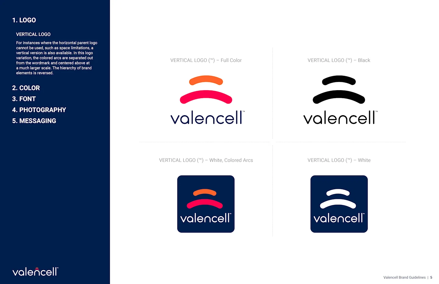
The new logo kept a recognizable connection to the earlier signal motif, but changed the tone. Rounded letterforms and a brighter palette made the identity feel more approachable without abandoning its technology roots.
That is the design decision visible in the work: continuity where recognition matters, change where the audience needs a different invitation.
A usable system
More than
a new logo.
The guidelines brought the identity into a system covering logo use, color, type, photography and messaging. The work needed to hold together across the website and other brand materials.
Messaging & website
Lead with life.
Support it with substance.
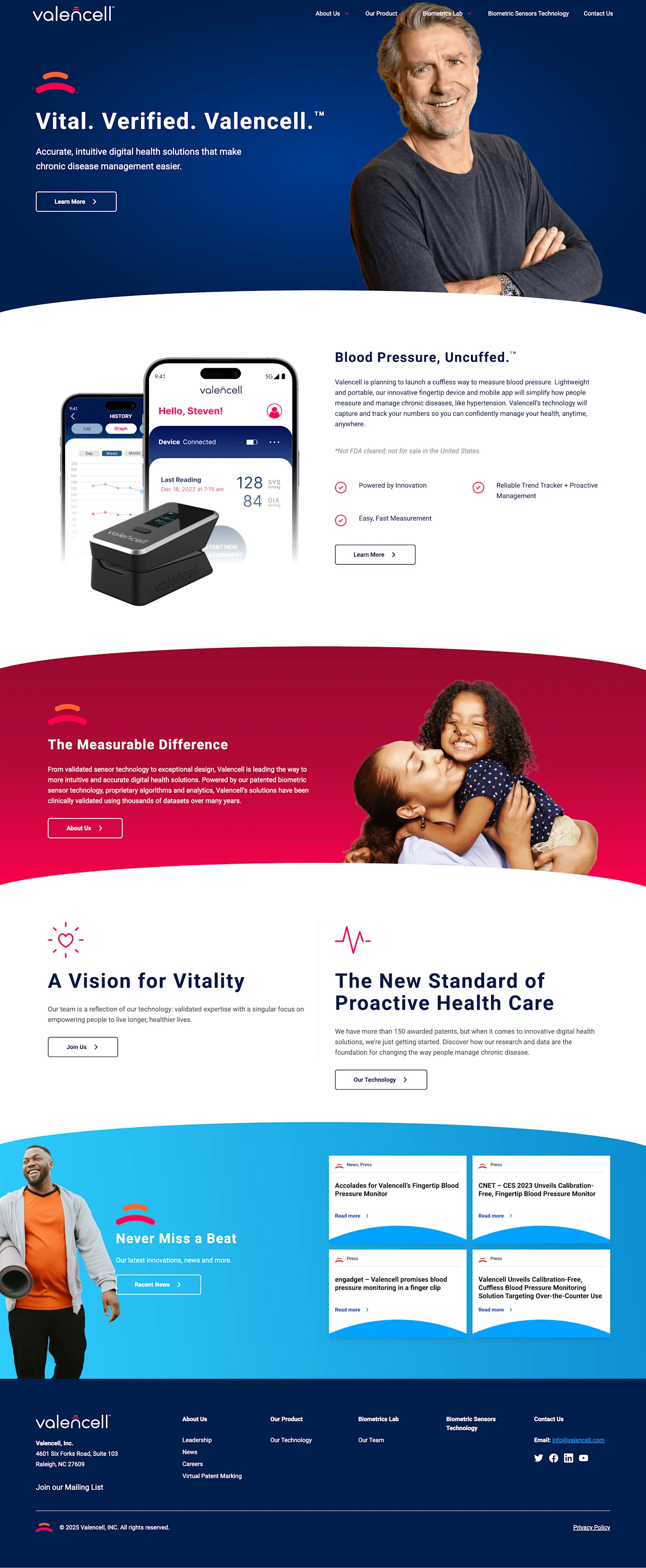
The historical website leads with “Vital. Verified. Valencell.” It gives the brand a short, memorable introduction before getting into the offering.
The page then combines product imagery with people and everyday moments. The sequence moves from the brand promise toward the product story and the company behind it.
What to notice in the work
- A concise opening. The headline creates a clear point of entry.
- A human setting. People and daily life share space with the technology.
- A connected identity. The navy, orange and magenta palette continues through the page.
- Room for explanation. Product and company sections add detail beneath the introduction.
The screenshot records the website creative from that assignment. Product language and regulatory references inside the image are historical.
What the work delivered
A brand ready for
a different audience.
A clearer story
Positioning and messaging for the planned shift from technology licensing toward a consumer-facing offer.
A connected identity
A revised logo and visual system, with guidelines to carry the brand across materials.
A digital home
A corporate website that brought the updated story, people and technology together.
The documented outcome here is the brand and website work. This case does not report product sales, launch results or clinical outcomes.
For another technical business, the useful starting point is the same: understand what changes for the audience before deciding what should change for the brand.
Put the thinking to work
Have a similar challenge?
Explore the capabilities behind work like this.
Create a reaction
New audience?
Let’s find your voice.
We help technical businesses make the value clear to the people they want to reach.
Case study by Carbon. Updated .
Explore more of our work